


I received some fantastic answers to last week's challenge. Well done to those who replied. Your names (and points) have been added to the leaderboard. Who will be top by the end of this week?
Anyhow, let's explore today's 5 gold nuggets:
1. FR EXPERT TIP:
Is an origin story the key to tapping into a whole ocean of new customers?
You may have attended Jerry O'Brien's webinar, where he walked us through the process of writing an origin story for one of our community members, Philip.
What became clear during and after the webinar was that many people (who had never heard of Philip or the service he provides) found themselves drawn to him because of his story.
If Jerry had used traditional marketing techniques while sharing Philip's service with the attendees, many would have left because it didn't resonate with them.
However, the story he told took them on a journey. They naturally moved along with Philip, eventually having the same epiphany he had. Suddenly, these people who had never thought about Philip or his service were asking themselves if they needed it too!
If you aren't currently using an origin story in your marketing, doesn't it make sense to at least test it to see how your market responds?
If you like to write, there are plenty of videos online that will help you craft your story (it's also well covered in Russell's book
Expert Secrets).
If writing isn't your thing, but you want to tap into the selling power of origin/epiphany bridge stories, send a message to Jerry here and have him do it all for you.
2. MARKETING TIP OF THE WEEK:
How many times have you convinced a friend or family member to watch a certain TV show, visit a particular restaurant, or use a specific product?
What is your success rate with these recommendations?
It's very high, right?
It feels smooth and gets people to take action because you are an
evangelist for these things. You know in your heart that they will LOVE what you're suggesting.
In those moments, without the doubts and fears of typical selling, you tap into your ability as a master salesperson. So, whether you're struggling to get sales or looking to take things to the next level, the marketing tip for this week is to read (or re-read) Guy Kawasaki's
Selling The Dream and become an evangelist for your product or service.
This simple shift has the potential to make a huge difference to every single communication you create, not to mention your energy, enthusiasm, and motivation. Guy's book was recommended to me at FHL by sales and marketing maven Brad Lloyd, and after reading it, I understand why.
Do you have a book, podcast, article, or video that you know is a MUST-READ/WATCH/LISTEN? *Share it with me, and I'll post it in next week's newsletter and add your points to the leaderboard.
3. TOP TIP FROM A FELLOW COMMUNITY MEMBER:
Craig Barber from London, England, teaches UX and UI design and today shares 5 mistakes to avoid in webpage design.
"Craig Barber here. I’ve spent over 40,000 hours designing websites. Websites for some of the biggest brands in the world including Citi, LG Mobile, Samsung and PayPal.
I’m going to cover the top 5 mistakes I see designers making right now.
Let’s dive in.
1. Using low contrast colours
Using colours without enough contrast is a big no-no. Especially when it comes to typography.
You must use high-contrast colours for your background and your type. Not only is this bad design. It makes things really difficult for people with vision impairment. Accessibility is something we must take into consideration.
Don’t know if your colours are high contrast enough? No problem. Here’s a free tool to help you out.
2. Using too many colours
Some designers use way too many colours in their designs. It creates a bad user experience because your users get overwhelmed with colours grabbing their attention. This directly affects things like click-through and conversion rates.
My advice is to use just 3 colours. One for your background. One for your typography. And one for your accents - things like buttons and calls to action.
3. Using too many fonts
Using too many fonts is quite common. When you use a bunch of different fonts it creates more work for your users. They have to ‘decipher’ each different font which creates a cognitive load. It also looks poor from a design aesthetic standpoint.
I recommend using just one font. Use just one font and utilise different weights for variation.
4. Too many things on the page
Some designers cram way too much information into any given space on the page. I know. You’re trying to get as much bang for your buck.
You must let your design breathe. Allow ample space for a limited number of elements within a given space. For example, If I’m designing a simple brochure-type website I like to put just one block of information in their viewport. This allows the user to absorb the information before scrolling down to the next section.
Remember, less is more.
5. Slow page load speeds
Our users are impatient. If your site takes too long to load, people will leave. The average bounce rate is measured in just seconds. Avoid heavy video on your home page. Also be mindful of large, high-resolution images that take ages to load.
Lastly, Google also ranks page speed as a major factor when it comes to search engine optimization. And mobile experience is a top priority for them. Make sure you’re using optimized images. Formats like SVG and WebP can help with reducing page load speed.
Summing up
The website design industry is extremely competitive.
Avoid making these mistakes, and you will be well on your way to that next awesome product design gig. Or your next big client.
- Craig"
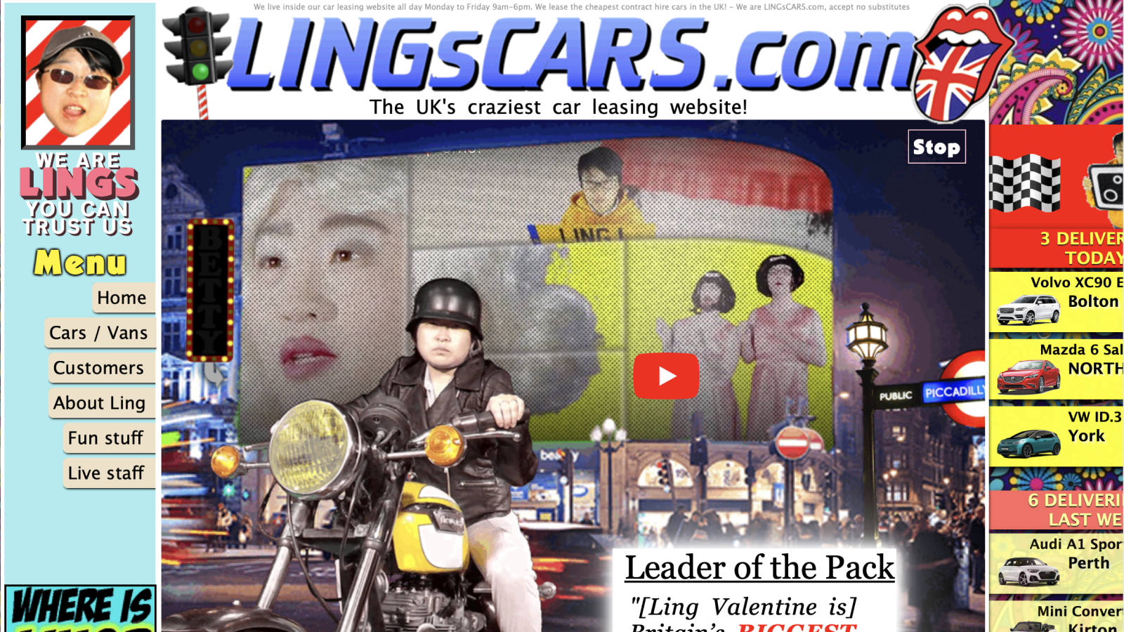
4. FUNNEL OF THE WEEK:
99% of websites have a white background, but this one makes me rethink my own page designs. *Take a look at this funnel and let me know what you think:
5. FOOD FOR THOUGHT:
“Build something 100 people love, not something 1 million people kind of like.” — Brian Chesky
Have a great weekend,
Lee

Live from Starbucks in NOLA
P.S. Would you like to volunteer your funnel for our subscribers to rate? *Send me a link, and I'll post it in next week's newsletter.
P.P.S. *Let me know what tips you've implemented from this and previous newsletters.
P.P.P.S. The * signifies areas where you can earn points. I'll be sending the top 5 individuals a prize at the end of the month.